
Accountant CRM and control centre
Designing a seamless experience that connects every touchpoint within an accountant’s workflow.

CONTEXT
Flow is a WebApp designed for Digital Bubble, an Italian accounting firm that develops smart solutions for professionals.
As part of their modular ecosystem, Flow was created to optimize daily operations and anticipate bottlenecks within accounting studios.
More than just a task tracker, it acts as an intelligent operational assistant, analyzing data in real time, predicting upcoming issues, and supporting accountants in planning their workload efficiently.
PROBLEM
Accounting studios often rely on disconnected tools such as spreadsheets, emails, and shared folders to manage clients, deadlines, and internal communication.
This fragmented workflow results in duplicated data, reduced visibility, and frequent manual updates.
As the workload increases, it becomes harder to track priorities, coordinate the team, and prevent mistakes or delays in daily operations.
Time
3 months
Project type
-
Solo project
-
Client project
My role
-
Organise information and content through information architecture
-
Wireframe design
-
Hi-fidelity and prototype
Who was involved
-
Stakeholders
-
Engineering manager
-
Customer

MVP scope
Since the client had already gathered qualitative feedback from professionals, they were confident about the idea, and the available time was limited, the goal of this MVP was to:
-
Validate client hypotheses.
-
Test the product in real conditions through hands-on use
CHALLENGES
The main challenge was managing a large amount of data while connecting multiple features within a single, coherent system.
At the same time, it was not yet clear how users would interact with the different sections of the application or move between them.
The design process, therefore, focused on defining a clear information structure and an intuitive navigation flow that could make the overall experience simple and consistent.
UX Process
Given the MVP scope and time constraints, the design process focused on defining the essential structure and validating the core logic of the platform.
1. Prioritizing key features
The most critical area was the client database and new records, which contains the main client information and serves as the foundation for all other sections. This was the first feature to be studied and defined.

2. Creating the flow chart
A detailed flow chart was developed to visualize the initial system structure and support early evaluations and decisions.
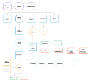
3. Mapping user touchpoints
We analyzed how different user types interact with the platform, identifying shared and unique touchpoints and defining their visibility permissions accordingly.
Design
Low fidelity
Once the main logic and user structure were defined, I moved into the exploration phase, creating low-fidelity wireframes to outline the overall layout, navigation, and core interactions of the platform.


Mid fidelity
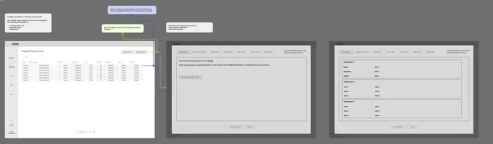
In the mid-fidelity stage, I focused mainly on the client information section.
Since the initial idea of using a modal for adding new fields proved effective, the main improvement involved repositioning the modal menu from the top to the left side.
This choice helped maintain consistency with the main navigation menu and freed up space at the top of the modal for additional contextual information.

This fidelity level was also useful to refine the information architecture within each section.
At the same time, I created a separate document to organize and categorize all data, helping to establish a clearer structure for future iterations.

BRANDING & COMPONENTS
Colors

Fonts

Components and Icons

High fidelity
In the high-fidelity stage, I applied the visual language defined in the style guide and used the components previously created to ensure consistency across the interface.
However, this phase was not limited to a simple UI adaptation. It involved a deeper exploration of the user experience, refining every interaction detail, defining the structure, and shaping how each feature would work within the overall system.


BULK EDIT EXPLORATION
During the high-fidelity phase, I also explored the bulk edit feature within the task list.
I tested two interaction patterns: opening an inline card next to the table or using a modal window.
The chosen solution was the modal, for several reasons:
-
to maintain visual consistency with the rest of the interface
-
to avoid compressing the table content and preserve readability
-
to allow future scalability by easily adding additional information or fields

1. Side card interaction

2. Modal interaction
This decision ensured a cleaner interface and a more consistent user experience across the platform.

Next steps
The next steps will focus on testing the overall usability of the platform and refining UX details, such as information organization and the relevance of the dashboard for different user personas.
Another key phase will be evaluating the UI to ensure that its visual language and interaction patterns are aligned with the needs and expectations of the target users.

